The CBO is Cambridge Books Online, the electronic books platform for Cambridge University Press (CUP). This is the platform into which Mike Chaplin and a team of programmers working for CUP will build the Socratic and Platonic Political Philosophy: Practicing a Politics of Reading.
Already at the beginning, I was worried that my vision of an open and fluid boundary between the written text and the online community of readers using social media to share ideas would dissolve as a rigid wall was established between the text and a wider public. Obviously, we are dealing with issues of access and questions of monetization, both of which are important concerns in a project like this, engaged as it is with a major University Press.
These concerns, however, have been assuaged, as Mike has sought my frequent advice and direction during these early phases of development. Right now he is playing around with mock-ups of the environment, and I have been suggesting models of online digital communication and interaction that might help provide a path to a more open, dynamic and interactive reading experience.
Toward More Opennness
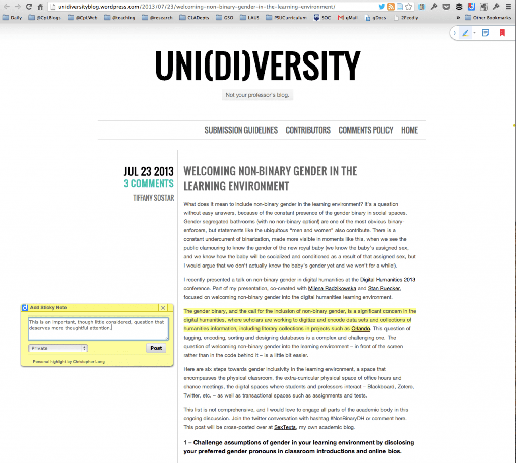
Mike’s first mock-ups sought to integrate some of the features of highlighting and annotation into the CBO environment. I had suggested that the way Diigo allows you to highlight text on any web site and take notes, which can be made public or private, might serve as a model for us.
Figure 1.0: Diigo on the Uni(di)versity blog:
Here you can see the ability to highlight and add a kind of sticky note that can be private or publicly viewed. I like the little menu bar at the top right to add notes, bookmarks and highlights. I also like the new feature that Diigo has added with the little orange dot on the right margin that indicates an annotation is at that location. I’d like us to develop a way to use such dots to indicate points of common interest among readers. The idea would be that the dots would get larger and more intense in those spots where multiple highlights and annotations are being added, so that hot spots of conversation and interest can be easily identified.
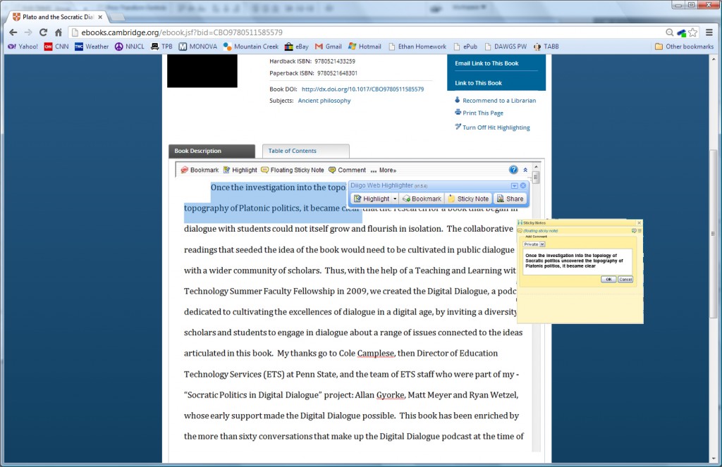
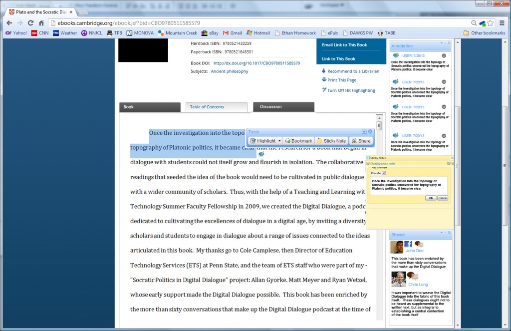
Mike then developed this initial mockup of what the book might look like in a CBO environment.
Figure 1.1: Reading Inline
Here the text appears immediately under the main area with information on the title, etc., with the sticky note metaphor floating in its own window outside of the main central column of text.
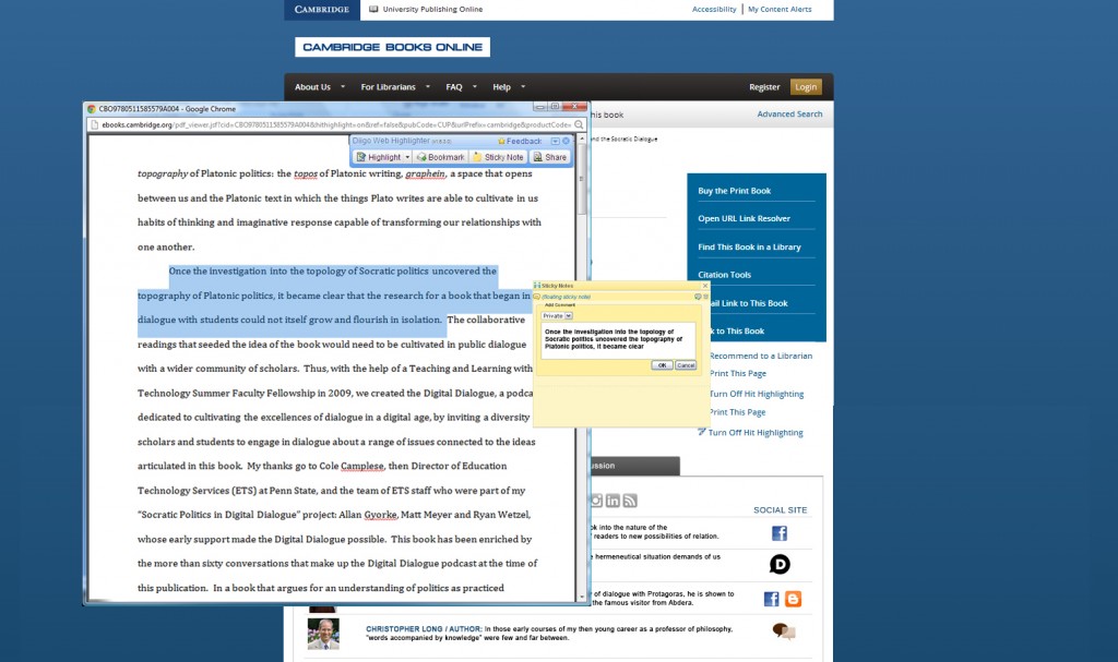
In the next image, Mike tried to illustrate how we might integrate social media into the system, bringing voices from outside into the the CBO environment and allowing those reading the book to share the text or their comments with wider social media communities.
Figure 1.2: Social Media and Notes
Here you can see how facebook and blogger might be integrated, and in turn, how I as author might appear as part of the conversation.
Philosophical issues of authorial authority lurk here. Although I am identified as the author, I like how I am not afforded special status and that I would appear in line with other comments and annotations.
The design ought not to reinforce the aura of authorial authority.
My voice as author will, of course, overdetermine the nature and direction of the conversation simply by virtue of the fact that the conversation centers around the things I wrote. Because of this, I will need to participate in these conversations with care, attending to the manner in which my responses themselves will have weight and authority, even if that authority is being directly challenged in the comments and annotations.
Extending Beyond the Column
In thinking about how to integrate comments and social media into the experience, I was beginning to feel too constrained by the single column of content sandwiched between two wide expanses of Cambridge University Press blue. I suggested to Mike something along the lines of CommentPress.
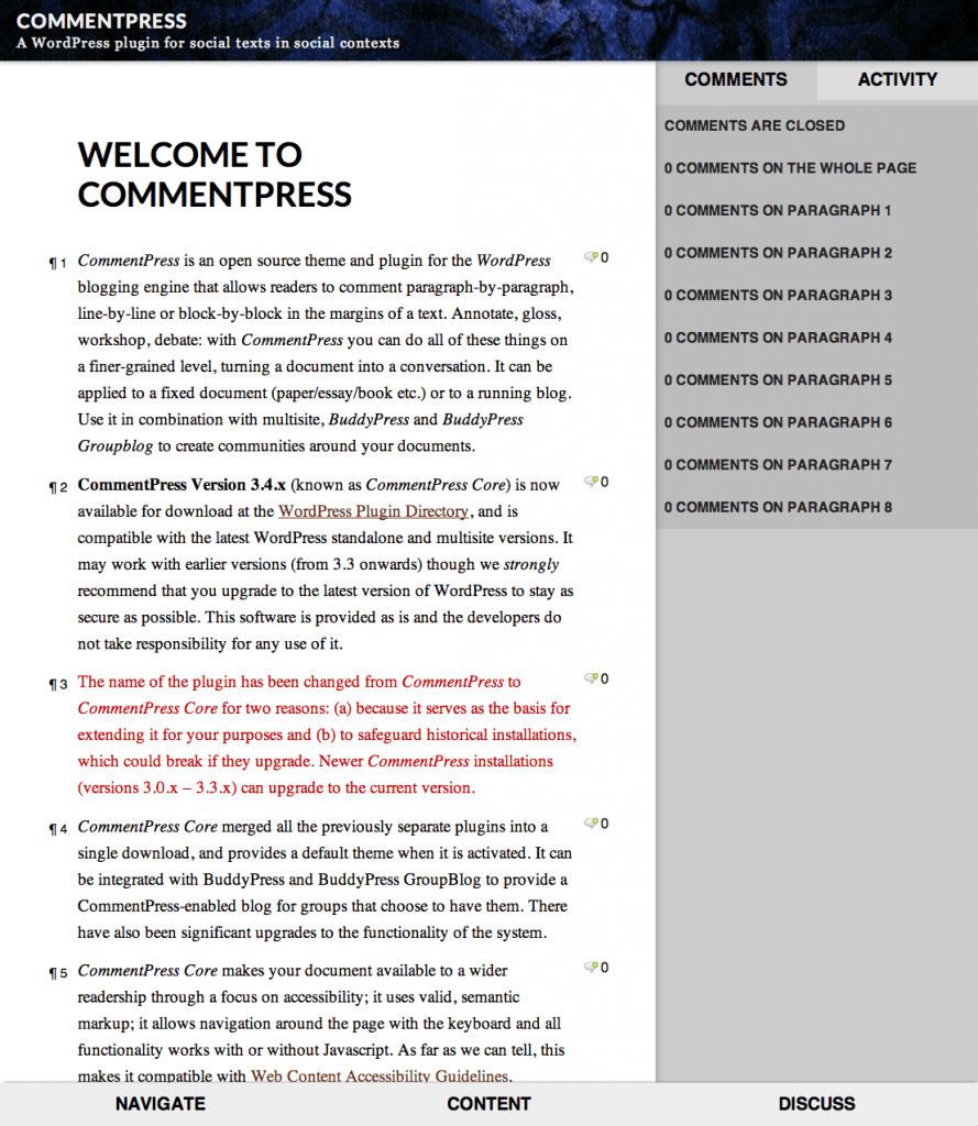
Figure 1.3: Comment Press
Here I liked the clean look in which reading is clearly a priority, but elements of interaction are inserted by means of chat bubbles and a column on the right with two tabs: comments and activity.
Also, and importantly, the text is organized by paragraph marks, not page numbers, a feature I would like to see added to both the print and digital editions of the book. This would make referring to specific passages consistent between the paper and the digital formats.
Mike then responded with a mockup that extended the inline reading experience outside of the single main column.
Figure 1.4: Extended Column
Here you begin to see the manner in which social media profiles can be drawn upon and the comments and annotations can extend beyond the main column of text even as the annotation column would be easy to access, if desired.
Directions to Pursue
I would be interested in your thoughts and ideas about the layout and direction developed thus far.
A number of features now seem to be emerging as important:
- Paragraph reference markers in the digital and print editions should be established to facilitate cross referencing in paper and digital environments;
- Textual “hotspot” markers could be implemented to suggest emerging areas of reader interest;
- Design elements should not overdetermine and reinforce authorial authority;
- There is not, as yet, a space for more extensive and detailed conversation in a forum. For this, I have in mind a model of something like Discourse.org, but I think I am getting ahead of myself…
